Best Feature Wall Colour Combinations for Indian Living Rooms in 2026
Once you move into a new flat, paint everything white or a safe cream, and then... nothing changes for years. The sofa's nice, the lights are fine, but the room just feels a bit flat. Nine times out of ten, it's the walls doing nothing for the space.
A feature wall fixes that without you having to touch your furniture at all. You just pick one wall, usually the one behind your sofa or your TV, and paint it something different from the rest. That's it. Suddenly the room has a focal point and looks like someone actually thought about it.
Here's what's working for Indian living rooms in 2026, plus some combinations you can actually try at home.
What's trending in feature wall colours right now
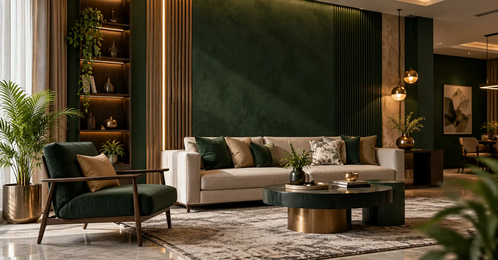
Deep green (emerald, not the mehendi green from a decade ago)
Green is still big, but people have moved on from the bright grassy shades to deeper, jewel-toned greens. It looks expensive, honestly, and it works really well in smaller flats because dark colours make a wall feel like it's pulling back instead of closing in on you, sounds odd but it's true once you see it. Pair it with a wooden console or brass lamp, and you're basically done.
Terracotta
This one's everywhere for a reason. It's warm, it's a little rustic, and it doesn't feel "trendy" in the way that goes out of style in two years. If you've got cane chairs or a jute rug lying around, terracotta walls will make them look intentional instead of random.
Navy blue
Navy behind a TV unit is having a real moment. It makes the screen kind of disappear into the wall during the day and looks properly moody at night. Throw in a gold-frame mirror or brass photo frames, and the whole wall suddenly looks curated.
Two-colour combos for living room
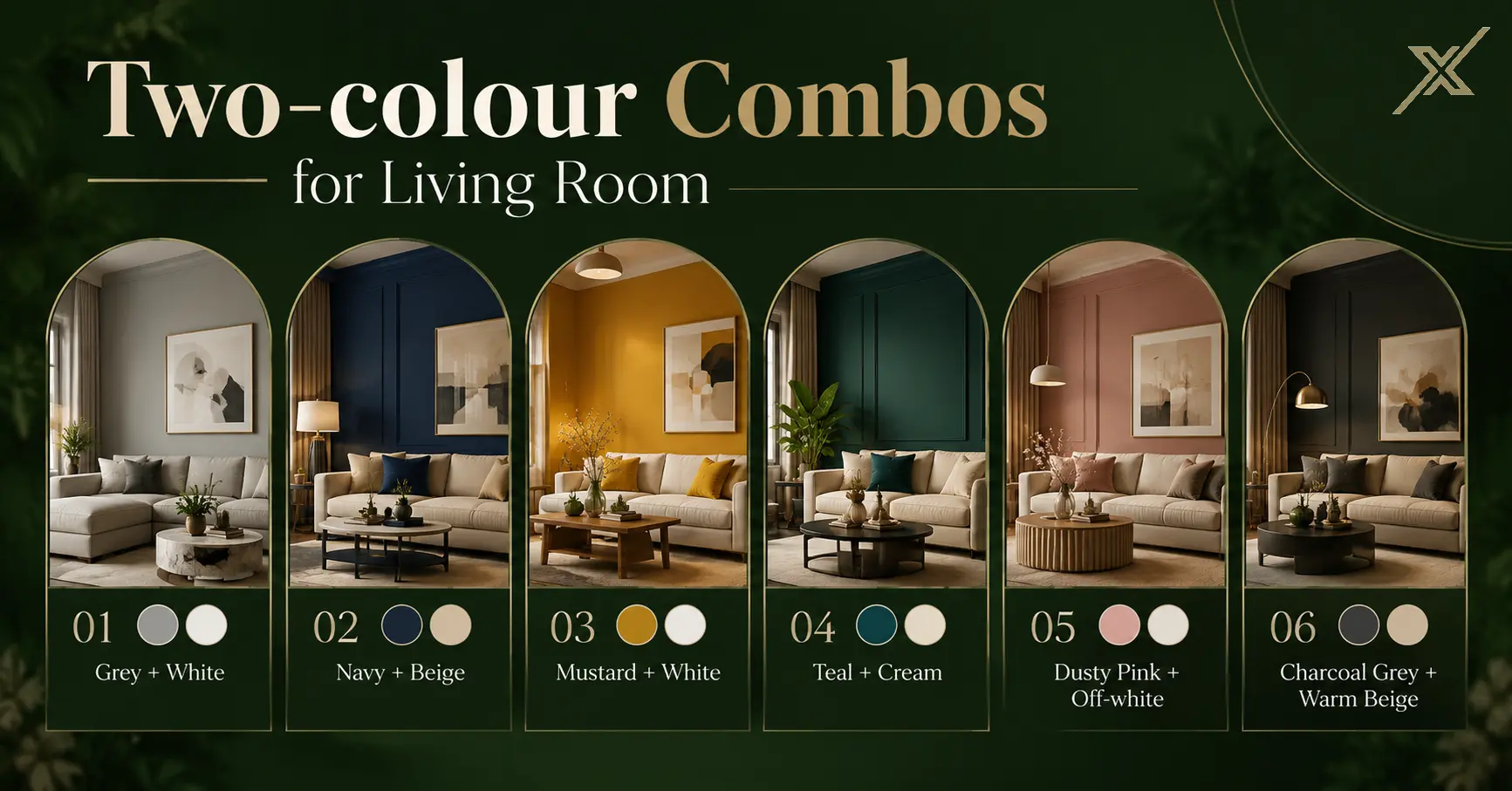
If picking one bold colour feels risky, doing two is usually the safer bet, and honestly still looks great.
Grey + white
This is the combination people default to when they don't want to think too much, and that's fine because it genuinely works with everything. Grey sofa, wooden sofa, colourful cushions, doesn't matter; grey and white play nice with all of it.
Navy + beige
Navy on the feature wall, beige everywhere else. Good pick if your room doesn't get a ton of sunlight, since the beige stops things from feeling too dark and closed off.
Mustard + white
If your living room faces north and barely sees the sun, mustard against white walls brings some warmth back into the space without you having to install extra lighting.
Teal + cream
Slightly unexpected but it works in almost any kind of light — sunny or shaded. Has a bit of a breezy, coastal feel that doesn't look out of place in a regular Indian apartment either.
Dusty pink + off-white
People assume pink is too soft or "girly" for a living room but dusty pink is muted enough that it doesn't read that way at all. Pair it with wooden furniture and it looks warm, not sugary.
Charcoal grey + warm beige
For when you want the room to feel a bit moody and layered instead of bright and open. Works best if your lighting is decent, in a dim room this combo can start feeling heavy.
Three-colour combos for living room
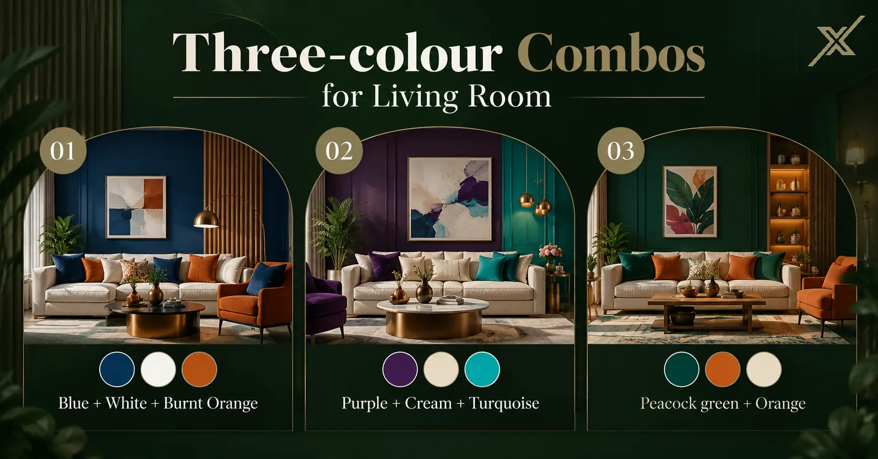
Blue + white + burnt orange
Works really well if you've already got some exposed brick or textured wall somewhere in the house. The orange keeps it warm, blue grounds it, white ties the whole thing together so it doesn't look chaotic.
Purple + cream + turquoise
This leans a bit more ethnic/desi in feel — think purple walls, cream trims, and turquoise furniture or cushions thrown in. Looks great with brass décor if you've got any lying around from home or gifted from family.
Peacock green + orange
Sounds like a strange pairing on paper but it isn't once it's up on a wall. Peacock green has that rich, jewel-tone thing going, orange adds warmth, and together they don't feel loud — just different from the usual grey-on-grey everyone does.
If you'd rather not experiment at all
Totally fair, not everyone wants their walls to be a conversation starter. If that's you, stick to:
Beige and white
Different shades of grey together
White with different finishes (matte vs slightly glossy) instead of a second colour
Cream and light brown
These age well, don't date your home, and are a safer bet if you're renting the place out or plan to sell later since they suit more buyers.
Things to think about before you pick a colour
Room size
Small rooms handle lighter walls better, with maybe one dark feature wall used carefully. Paint a small room fully in a dark shade, and it can start feeling like a box.
Natural light
That colour swatch that looked gorgeous under shop lighting can look totally different on your actual wall. Always, always test a small patch and look at it during the day and again at night before you commit; this one step saves so many redo jobs.
What you already own
Unless you're replacing your sofa too, pick colours that go with what's already in the room. Repainting a wall is a weekend job. Replacing a whole living room set is not.
Which wall should you even pick?
Usually it's one of these three:
Behind the sofa: most common pick, first thing guests see
Behind the TV: frames your media unit nicely
The wall facing the main entrance gives a strong first impression as soon as someone walks in
Try to avoid walls broken up by a lot of doors, windows, or switchboards; the colour doesn't get room to actually show up properly.
The finishing
A matt finish hides small wall flaws and looks classy, but it's harder to wipe clean. Satin or eggshell is a nice middle ground: some shine, it is easy to clean, and it is good for living rooms that see a lot of daily use. Glossy reflects the most light but also shows up every little bump or uneven patch on the wall, so it needs a really smooth surface underneath.
Conclusion
A feature wall is one of the cheapest ways to make your living room feel like it actually belongs to you and not like a rental you moved into last week. Go bold with emerald or peacock green, keep it simple with grey and white, or go warm with terracotta and mustard; whichever direction you pick, test it on your own wall first, live with the sample for a day or two, and then commit.
And if you'd rather not leave it to trial and error, that's exactly where interior designers in Bangalore come in, they know how a colour will actually sit in your specific room, lighting and all, before a single tin of paint is opened. If you're looking to get it right the first time, working with some of the best interior designers in Bangalore can save you the repainting, the guesswork, and honestly, a fair bit of money too.
Once you move into a new flat, paint everything white or a safe cream, and then... nothing changes for years. The sofa's nice, the lights are fine, but the room just feels a bit flat. Nine times out of ten, it's the walls doing nothing for the space.
A feature wall fixes that without you having to touch your furniture at all. You just pick one wall, usually the one behind your sofa or your TV, and paint it something different from the rest. That's it. Suddenly the room has a focal point and looks like someone actually thought about it.
Here's what's working for Indian living rooms in 2026, plus some combinations you can actually try at home.
What's trending in feature wall colours right now
Deep green (emerald, not the mehendi green from a decade ago)
Green is still big, but people have moved on from the bright grassy shades to deeper, jewel-toned greens. It looks expensive, honestly, and it works really well in smaller flats because dark colours make a wall feel like it's pulling back instead of closing in on you, sounds odd but it's true once you see it. Pair it with a wooden console or brass lamp, and you're basically done.
Terracotta
This one's everywhere for a reason. It's warm, it's a little rustic, and it doesn't feel "trendy" in the way that goes out of style in two years. If you've got cane chairs or a jute rug lying around, terracotta walls will make them look intentional instead of random.
Navy blue
Navy behind a TV unit is having a real moment. It makes the screen kind of disappear into the wall during the day and looks properly moody at night. Throw in a gold-frame mirror or brass photo frames, and the whole wall suddenly looks curated.
Two-colour combos for living room
If picking one bold colour feels risky, doing two is usually the safer bet, and honestly still looks great.
Grey + white
This is the combination people default to when they don't want to think too much, and that's fine because it genuinely works with everything. Grey sofa, wooden sofa, colourful cushions, doesn't matter; grey and white play nice with all of it.
Navy + beige
Navy on the feature wall, beige everywhere else. Good pick if your room doesn't get a ton of sunlight, since the beige stops things from feeling too dark and closed off.
Mustard + white
If your living room faces north and barely sees the sun, mustard against white walls brings some warmth back into the space without you having to install extra lighting.
Teal + cream
Slightly unexpected but it works in almost any kind of light — sunny or shaded. Has a bit of a breezy, coastal feel that doesn't look out of place in a regular Indian apartment either.
Dusty pink + off-white
People assume pink is too soft or "girly" for a living room but dusty pink is muted enough that it doesn't read that way at all. Pair it with wooden furniture and it looks warm, not sugary.
Charcoal grey + warm beige
For when you want the room to feel a bit moody and layered instead of bright and open. Works best if your lighting is decent, in a dim room this combo can start feeling heavy.
Three-colour combos for living room
Blue + white + burnt orange
Works really well if you've already got some exposed brick or textured wall somewhere in the house. The orange keeps it warm, blue grounds it, white ties the whole thing together so it doesn't look chaotic.
Purple + cream + turquoise
This leans a bit more ethnic/desi in feel — think purple walls, cream trims, and turquoise furniture or cushions thrown in. Looks great with brass décor if you've got any lying around from home or gifted from family.
Peacock green + orange
Sounds like a strange pairing on paper but it isn't once it's up on a wall. Peacock green has that rich, jewel-tone thing going, orange adds warmth, and together they don't feel loud — just different from the usual grey-on-grey everyone does.
If you'd rather not experiment at all
Totally fair, not everyone wants their walls to be a conversation starter. If that's you, stick to:
Beige and white
Different shades of grey together
White with different finishes (matte vs slightly glossy) instead of a second colour
Cream and light brown
These age well, don't date your home, and are a safer bet if you're renting the place out or plan to sell later since they suit more buyers.
Things to think about before you pick a colour
Room size
Small rooms handle lighter walls better, with maybe one dark feature wall used carefully. Paint a small room fully in a dark shade, and it can start feeling like a box.
Natural light
That colour swatch that looked gorgeous under shop lighting can look totally different on your actual wall. Always, always test a small patch and look at it during the day and again at night before you commit; this one step saves so many redo jobs.
What you already own
Unless you're replacing your sofa too, pick colours that go with what's already in the room. Repainting a wall is a weekend job. Replacing a whole living room set is not.
Which wall should you even pick?
Usually it's one of these three:
Behind the sofa: most common pick, first thing guests see
Behind the TV: frames your media unit nicely
The wall facing the main entrance gives a strong first impression as soon as someone walks in
Try to avoid walls broken up by a lot of doors, windows, or switchboards; the colour doesn't get room to actually show up properly.
The finishing
A matt finish hides small wall flaws and looks classy, but it's harder to wipe clean. Satin or eggshell is a nice middle ground: some shine, it is easy to clean, and it is good for living rooms that see a lot of daily use. Glossy reflects the most light but also shows up every little bump or uneven patch on the wall, so it needs a really smooth surface underneath.
Conclusion
A feature wall is one of the cheapest ways to make your living room feel like it actually belongs to you and not like a rental you moved into last week. Go bold with emerald or peacock green, keep it simple with grey and white, or go warm with terracotta and mustard; whichever direction you pick, test it on your own wall first, live with the sample for a day or two, and then commit.
And if you'd rather not leave it to trial and error, that's exactly where interior designers in Bangalore come in, they know how a colour will actually sit in your specific room, lighting and all, before a single tin of paint is opened. If you're looking to get it right the first time, working with some of the best interior designers in Bangalore can save you the repainting, the guesswork, and honestly, a fair bit of money too.
Let's
Build
something
enduring
Every exceptional space begins with a conversation. We'd be honored to learn about your vision.
Let's
Build
something
enduring
Every exceptional space begins with a conversation. We'd be honored to learn about your vision.
Let's
Build
something
enduring
Every exceptional space begins with a conversation. We'd be honored to learn about your vision.